Learn CSS Through Photography: Build a Portfolio Gallery
SkillVeris Team
Content Team
CSS Grid and Flexbox are the two layout systems every web developer must know, and photography makes them tangible.
In this guide, you'll learn:
- A photo gallery gives instant visual feedback: change a grid column and you watch the layout update.
- The repeat(auto-fill, minmax(280px, 1fr)) pattern builds responsive grids with zero media queries.
- Combining aspect-ratio with object-fit: cover keeps image cards uniform without distorting photos.
- Animate only transform and opacity so effects stay GPU-accelerated and smooth on every device.
1Why Photography Is Perfect for Learning CSS
CSS is a visual language, and learning it with visual content is dramatically more effective than memorising properties in isolation. Every CSS rule you write instantly changes how photos are arranged, sized, and revealed.
When you add a gap and the grid breathes, or you write a transform: scale(1.05) and an image lifts on hover, the connection between code and output is immediate and satisfying.
The gallery project covers CSS Grid, Flexbox, transitions, custom properties, media queries, and a touch of JavaScript — the complete modern CSS toolkit.
2Project Structure
The project keeps a small, flat structure: one HTML file for markup, one stylesheet, a minimal JavaScript file for the lightbox and filter logic, and a folder of images.
Use your own photos, or download royalty-free images from Unsplash (unsplash.com) or Pexels (pexels.com). Aim for a mix of landscape and portrait orientations — it makes the grid layout more interesting.
Folder Layout
photo-gallery/
index.html # gallery markup
style.css # all CSS
app.js # lightbox + filter logic (minimal JS)
photos/ # your images
city-1.jpg
nature-1.jpg
...3The HTML for the Gallery
The markup is a header with a filter bar of buttons, a main element holding the gallery of figure cards, and a hidden lightbox container at the bottom of the body.
Note the loading="lazy" attribute on images: the browser only loads photos when they're about to scroll into view. It's essential for a gallery with many images.
index.html
<!DOCTYPE html>
<html lang="en">
<head>
<meta charset="UTF-8">
<meta name="viewport" content="width=device-width, initial-scale=1">
<title>Photo Gallery</title>
<link rel="stylesheet" href="style.css">
</head>
<body>
<header>
<h1>My Photography</h1>
<nav class="filter-bar">
<button class="active" data-filter="all">All</button>
<button data-filter="city">City</button>
<button data-filter="nature">Nature</button>
<button data-filter="portrait">Portrait</button>
</nav>
</header>
<main class="gallery">
<figure class="photo-card" data-category="city">
<img src="photos/city-1.jpg" alt="City skyline at dusk" loading="lazy">
<figcaption>City Skyline · Tokyo</figcaption>
</figure>
<!-- repeat for each photo -->
</main>
<div class="lightbox" id="lightbox">
<img id="lightbox-img" src="" alt="">
<button class="close" id="close-lightbox">×</button>
</div>
<script src="app.js"></script>
</body>
</html>4CSS Grid: The Foundation Layout
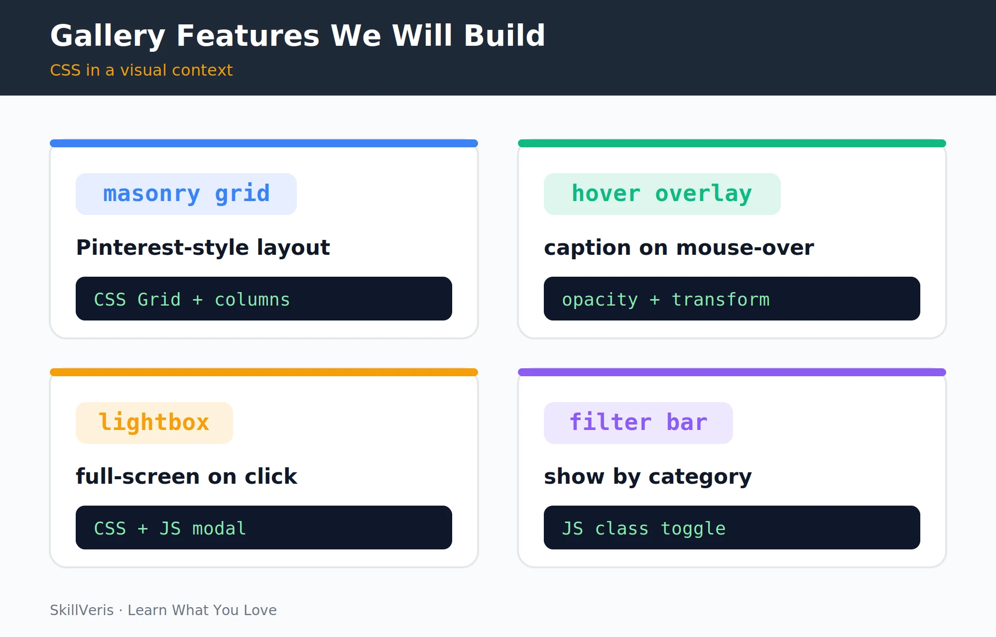
The gallery is laid out as a CSS Grid against a dark background, with consistent spacing and a centred maximum width. Four gallery features — masonry grid, hover overlay, lightbox, and filter bar — each teach a different CSS technique.
repeat(auto-fill, minmax(280px, 1fr)) is one of the most powerful CSS Grid patterns: it creates as many columns as fit, each at least 280px wide, expanding to fill available space. On a wide screen that's 4 columns, on a tablet 2, and on mobile 1 — with zero media queries needed for this behaviour.
style.css
/* style.css */
*, *::before, *::after { box-sizing: border-box; }
body {
margin: 0;
background: #0f172a;
color: #e5e7eb;
font-family: 'Helvetica Neue', Arial, sans-serif;
}
.gallery {
display: grid;
grid-template-columns: repeat(auto-fill, minmax(280px, 1fr));
gap: 16px;
padding: 24px;
max-width: 1400px;
margin: 0 auto;
}5Aspect Ratio and Object Fit
Each photo card has rounded corners, hidden overflow, and relative positioning so the caption can be layered on top. The image itself fills the card and lifts slightly on hover with a smooth transform transition.
aspect-ratio: 4/3 keeps every card the same height regardless of the photo's original dimensions. object-fit: cover crops the image to fill the space without distortion — the combination eliminates the broken grid you get when images have different sizes.
Card and Image Styles
.photo-card {
margin: 0;
border-radius: 12px;
overflow: hidden;
position: relative;
cursor: pointer;
}
.photo-card img {
width: 100%;
aspect-ratio: 4 / 3; /* consistent card height */
object-fit: cover; /* crop, never distort */
display: block;
transition: transform 0.4s ease;
}
.photo-card:hover img {
transform: scale(1.06);
}6Hover Overlays with Transitions
The caption is absolutely positioned along the bottom of the card with a gradient background, hidden below the card by default and slid into view on hover.
This pattern — hide with transform: translateY(100%) and reveal with translateY(0) on hover — is far smoother than toggling display: none because transforms are GPU-accelerated. The gradient overlay ensures caption text is always readable regardless of the photo's colours.
💡Pro Tip
Always use transform and opacity for CSS animations — not width, height, top, or margin. Only transform and opacity trigger GPU compositing; everything else causes layout recalculation and janky animation on less powerful devices.
Caption Reveal
.photo-card figcaption {
position: absolute;
bottom: 0; left: 0; right: 0;
padding: 32px 16px 16px;
background: linear-gradient(transparent, rgba(0,0,0,0.8));
color: #fff;
font-size: 0.9rem;
letter-spacing: 0.5px;
transform: translateY(100%); /* hidden below the card */
transition: transform 0.3s ease;
}
.photo-card:hover figcaption {
transform: translateY(0%); /* slides up on hover */
}7Responsive Grid with Media Queries
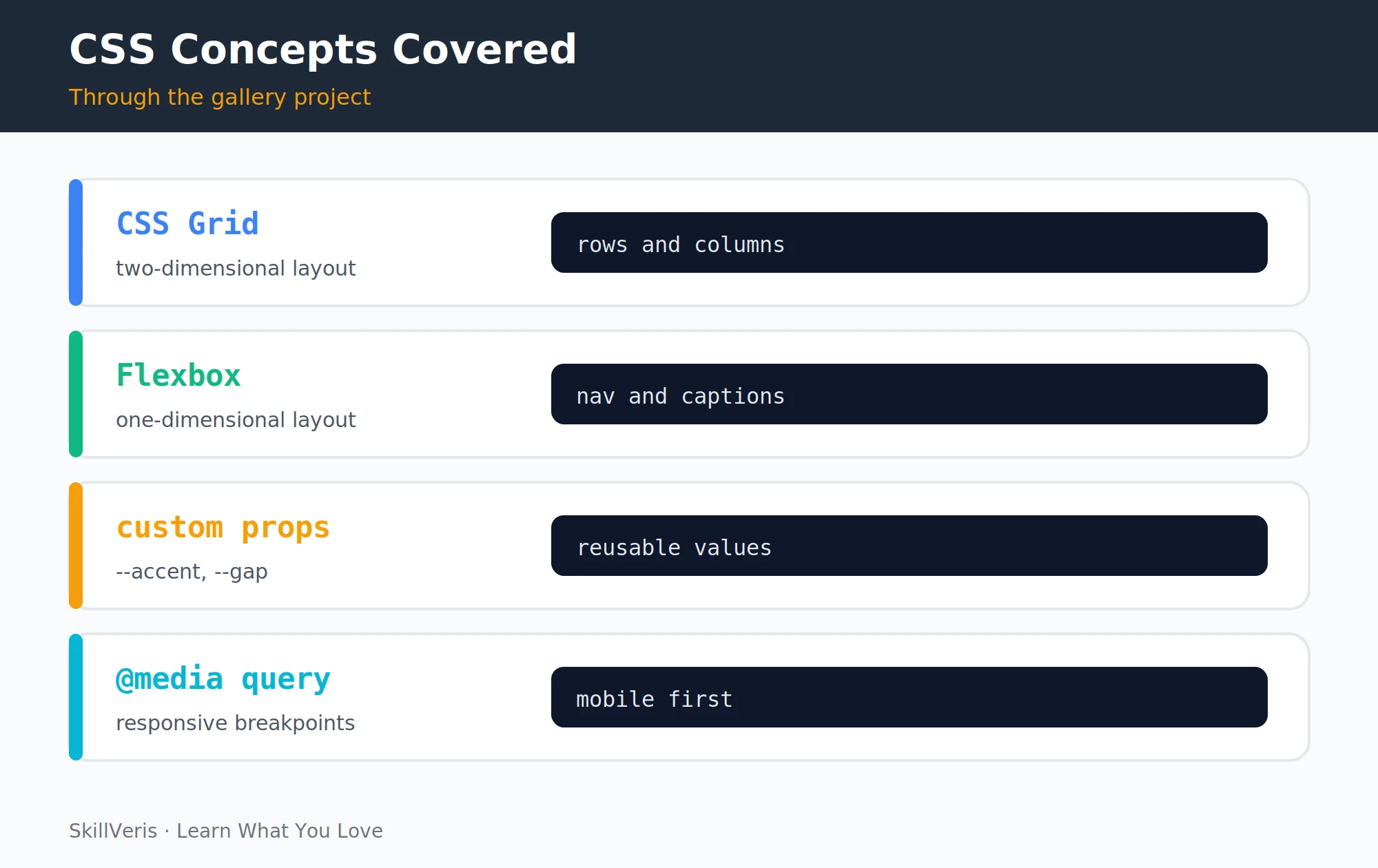
The four CSS concepts this project teaches in a visual context are CSS Grid, Flexbox, custom properties, and media queries. The auto-fill/minmax grid handles most responsiveness automatically — you only need explicit breakpoints for the header and filter bar.
Mobile-first principle: write CSS for mobile screens first, then use min-width media queries to adapt for larger screens. It produces cleaner, lighter stylesheets than the reverse.
Header Breakpoints
header {
display: flex;
justify-content: space-between;
align-items: center;
flex-wrap: wrap;
gap: 16px;
padding: 24px;
border-bottom: 1px solid #1e293b;
}
@media (max-width: 600px) {
header {
flex-direction: column;
text-align: center;
}
.filter-bar {
justify-content: center;
}
}8CSS Custom Properties
Define your design tokens once in :root — accent colour, backgrounds, text colours, radius, gap, and transition — then reference them throughout the stylesheet with var().
CSS custom properties (variables) let you change the entire colour scheme by updating five lines at the top of the file. It's also how design systems and dark/light mode switching work — the same technique used at scale in every major design system.
Design Tokens
:root {
--accent: #f59e0b;
--bg: #0f172a;
--surface: #1e293b;
--text: #e5e7eb;
--muted: #9aa3af;
--radius: 12px;
--gap: 16px;
--transition: 0.3s ease;
}
/* Use them throughout */
.gallery { gap: var(--gap); }
.photo-card { border-radius: var(--radius); }
.filter-bar button.active { border-color: var(--accent); color: var(--accent); }9The Lightbox Modal
The lightbox is a fixed, full-screen overlay that is hidden by default and shown as a centred flex container when the open class is added. A small JavaScript handler wires photo clicks to open it and clicks on the backdrop or close button to dismiss it.
Lightbox Styles
.lightbox {
display: none;
position: fixed; inset: 0;
background: rgba(0,0,0,0.92);
justify-content: center;
align-items: center;
z-index: 1000;
}
.lightbox.open { display: flex; }
.lightbox img { max-width: 90vw; max-height: 90vh; border-radius: 8px; }
.lightbox .close { position:absolute; top:16px; right:20px; background:none;
border:none; color:#fff; font-size:2rem; cursor:pointer; }
app.js — Open and Close
// app.js — open lightbox on photo click
const lightbox = document.getElementById('lightbox');
const lightboxImg = document.getElementById('lightbox-img');
document.querySelectorAll('.photo-card img').forEach(img => {
img.addEventListener('click', () => {
lightboxImg.src = img.src;
lightboxImg.alt = img.alt;
lightbox.classList.add('open');
});
});
document.getElementById('close-lightbox').addEventListener('click',
() => lightbox.classList.remove('open'));
lightbox.addEventListener('click', e => {
if (e.target === lightbox) lightbox.classList.remove('open');
});10Category Filter Bar
The filter bar toggles which photos are visible by reading a data attribute on each button and comparing it against each card's category.
HTML data-* attributes are the correct way to store custom data on elements. They're readable from JavaScript via element.dataset.category and don't affect styling or semantics. This pattern appears in every filter UI, tab panel, and drag-and-drop interface.
Filter Logic
// Filter photos by category using data attributes
document.querySelectorAll('.filter-bar button').forEach(btn => {
btn.addEventListener('click', () => {
document.querySelector('.filter-bar .active').classList.remove('active');
btn.classList.add('active');
const filter = btn.dataset.filter;
document.querySelectorAll('.photo-card').forEach(card => {
const show = filter === 'all' || card.dataset.category === filter;
card.style.display = show ? '' : 'none';
});
});
});11Finishing Touches
A few extra refinements turn the gallery from functional into polished — a staggered entrance animation, keyboard accessibility, image optimisation, and a free deployment.
- Loading animation: add animation: fadeIn 0.4s ease to .photo-card for a staggered entrance effect.
- Keyboard accessibility: close the lightbox on the Escape key with a document.addEventListener('keydown', ...) handler.
- Image optimisation: compress images with Squoosh (squoosh.app) before deploying — uncompressed photos are the single biggest performance issue on gallery sites.
- Deploy: push to GitHub and enable GitHub Pages in repository settings for a free live URL.
12Key Takeaways
These principles carry over to almost every layout you'll build with CSS, far beyond a photo gallery.
- repeat(auto-fill, minmax(280px, 1fr)) is the one CSS Grid pattern that makes most responsive grids work without media queries.
- Use aspect-ratio + object-fit: cover to keep image cards uniform without distorting photos.
- Animate with transform and opacity only — they're GPU-accelerated and stay smooth on all devices.
- CSS custom properties make theming, dark mode, and design consistency straightforward.
13What to Learn Next
Once the gallery works, keep growing your CSS skills with a few natural next steps.
- Add smooth filter animations: use opacity and transform: scale transitions instead of toggling display:none.
- React Hooks Explained — rebuild the gallery as a React component with state-driven filters.
- How to Build a Developer Portfolio — this gallery can be your portfolio itself.
14Frequently Asked Questions
Q: What is the difference between CSS Grid and Flexbox?
A: Flexbox is one-dimensional: it lays out items in a single row or column. CSS Grid is two-dimensional: it arranges items in rows and columns simultaneously. Use Flexbox for navigation bars, button groups, and card content, and use Grid for overall page layouts and photo galleries. They complement each other perfectly.
Q: How do I make a true Pinterest-style masonry layout in CSS?
A: The CSS columns property creates a column-based masonry layout: .gallery { columns: 3; gap: 16px; } with .photo-card { break-inside: avoid; }. True masonry, where items fill gaps optimally, requires JavaScript or the experimental CSS grid-template-rows: masonry (not yet in all browsers as of 2026).
Q: Should I use CSS Grid or a framework like Bootstrap?
A: Learn CSS Grid first — it gives you a deep understanding of layout that makes any framework easier to use. Bootstrap's grid is built on Flexbox and CSS Grid underneath. Once you understand the fundamentals, Bootstrap accelerates production work; without them, you're fighting magic class names.
Q: How do I optimise images for the web?
A: Resize images to the largest size they'll be displayed, no larger. Convert to WebP format for 30–50% smaller files, use loading="lazy" on images below the fold, and use srcset to serve different sizes for different screen densities. Squoosh (squoosh.app) handles all of this for free in the browser.
Get The Print Version
Download a PDF of this article for offline reading.
About the Publisher
SkillVeris Team
Content Team
We believe the best way to learn tech is through what you already love — sports, music, photography, and more.
View all postsRelated Posts




Never miss an update
Get the latest tutorials and guides delivered to your inbox.
No spam. Unsubscribe anytime.