Exploratory Data Analysis (EDA) Explained
SkillVeris Team
Data Science Team
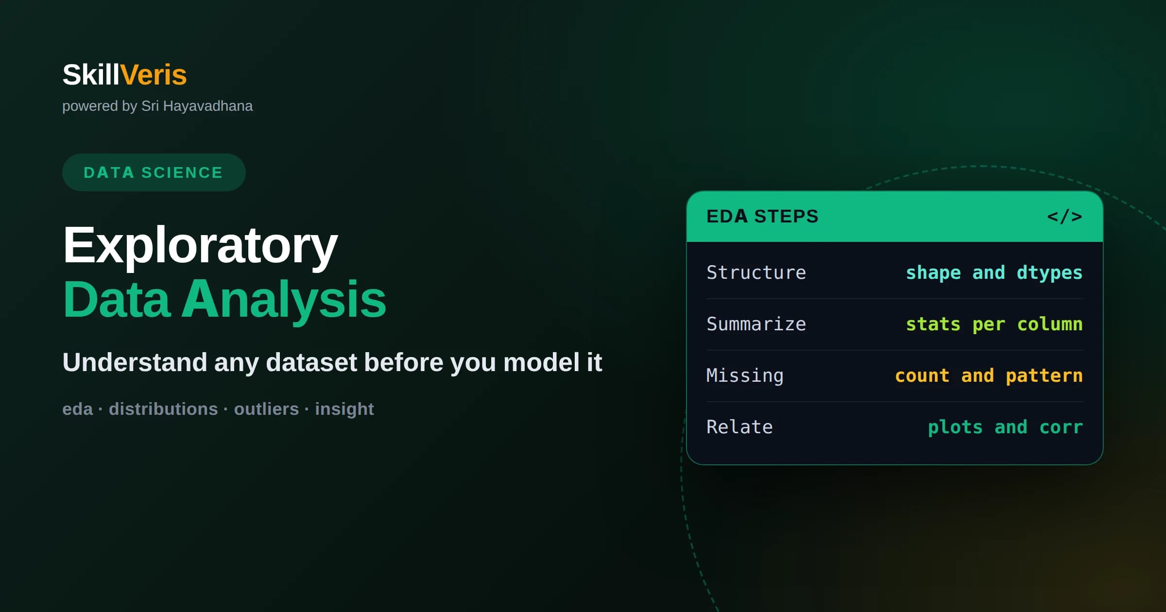
EDA is the systematic first look at a dataset that reveals its shape, quality, and hidden patterns before any model is built.
In this guide, you'll learn:
- The core toolkit is small: summary statistics, distribution plots, missing-value checks, and relationship plots between variables.
- Good EDA prevents expensive mistakes by catching leaks, outliers, and wrong assumptions early rather than after modeling.
- Every EDA should end with written notes and questions that guide feature engineering and model choice.
1What Exploratory Data Analysis Actually Is
Exploratory data analysis, or EDA, is the practice of examining a dataset to understand its structure, quality, and patterns before you build any model or draw formal conclusions. In plain terms, it is the process of getting to know your data by looking at it from many angles: how big it is, what each column means, how values are distributed, what is missing, and how variables relate to one another. The goal is understanding, not prediction.
The term was popularized by the statistician John Tukey, who argued that analysts should let the data speak first rather than rushing to confirm a hypothesis. That philosophy still holds. Before you fit a regression or train a classifier, you want to know whether the data is even suitable for the question you are asking. EDA is where you find out.
A useful way to think about EDA is as a conversation. You ask the data simple questions, it answers with numbers and charts, and each answer raises the next question. You are not trying to prove anything yet. You are building an accurate mental model of what you are working with so that every later decision rests on evidence instead of assumption.
2Why EDA Matters More Than It Seems
It is tempting to skip straight to modeling because that feels like the productive part. In reality, most modeling failures trace back to something that basic exploration would have caught. A column that looks numeric but is stored as text, a target variable that leaks future information, a handful of extreme outliers dragging every average sideways: these problems are invisible in the final metric but obvious in a five-minute EDA session.
EDA also protects you from asking the wrong question. If you plan to predict customer churn but discover that ninety-nine percent of records are active customers, you now know the problem is imbalanced and that raw accuracy will be misleading. That single insight changes your entire approach. Finding it early saves days of confused debugging later.
Finally, EDA builds intuition you will reuse constantly. The more datasets you explore, the faster you recognize familiar shapes, common data-quality traps, and promising relationships. That intuition is one of the most durable skills a data practitioner can develop.
3The First Look: Shape and Structure
Every EDA begins with orientation. How many rows and columns are there? What is the data type of each column? What do the first and last few rows look like? In a tool like pandas you answer these with a handful of commands that report dimensions, column names, and inferred types. This first pass tells you the scale of the problem and whether the data loaded the way you expected.
Pay special attention to data types. A date stored as a string cannot be sorted chronologically until you convert it. A category stored as an integer might be treated as a quantity by accident. Catching these mismatches now prevents subtle bugs later, because everything downstream assumes the types are correct.
Also scan the column names and a few sample rows to confirm the data means what the documentation claims. Real datasets are full of surprises: duplicated headers, mysterious codes, and columns that are entirely empty. A quick visual scan surfaces these before they cost you time.
4Summary Statistics That Reveal the Basics
Once you know the structure, describe each variable numerically. For numeric columns, look at the count, mean, standard deviation, minimum, maximum, and the quartiles. These few numbers tell you the center, spread, and range of the data at a glance. A minimum of negative one thousand in a column that should hold ages is an immediate red flag.
For categorical columns, count the unique values and their frequencies. This shows you how many categories exist and whether they are balanced or dominated by a single value. A category with hundreds of distinct values behaves very differently from one with three, and that distinction shapes how you will encode it later.
Compare the mean and the median for numeric columns. When they differ a lot, the distribution is skewed, meaning values pile up on one side with a long tail on the other. Skew affects which summary you should trust and which transformations might help. The median resists outliers while the mean does not, so watching both is informative.
5Finding and Understanding Missing Values
Missing data is one of the most important things EDA reveals. Start by counting how many values are absent in each column and expressing it as a percentage. A column that is five percent empty is usually manageable; one that is ninety percent empty may be useless or may signal that the value is only recorded in special cases.
Just as important is understanding why data is missing. Sometimes absence is random noise. Other times it carries meaning, such as a blank discount field that really means no discount was applied. Treating a meaningful blank as random missingness throws away signal, so pause to ask what each gap represents before you decide how to handle it.
Visualizing missingness helps too. A simple heatmap of where values are absent can reveal patterns, like entire rows that are blank or columns that go missing together. Those patterns often point to how the data was collected and where its limits lie.
6Univariate Analysis: One Variable at a Time
Univariate analysis means studying each variable on its own. For numeric variables, a histogram shows the shape of the distribution: whether it is bell-shaped, skewed, bimodal with two peaks, or something stranger. The shape hints at what generated the data and whether a transformation might make it easier to model.
A box plot complements the histogram by making outliers and spread explicit. It draws the middle half of the data as a box and flags unusually distant points. When you see many points far beyond the whiskers, you have outliers to investigate, and investigating them often teaches you something about the data collection process.
For categorical variables, a bar chart of frequencies does the equivalent job. It shows which categories dominate and which are rare. Rare categories can be noisy and may need to be grouped together, while a dominant category can bias models that are not designed for imbalance.
7Bivariate Analysis: How Variables Relate
The most valuable insights usually come from looking at two variables together. A scatter plot of two numeric variables reveals whether they rise together, fall together, or move independently. A clear upward trend suggests a relationship worth modeling; a shapeless cloud suggests the two carry little information about each other.
When one variable is categorical and the other numeric, grouped box plots or bar charts compare the numeric distribution across categories. This is how you spot that, say, one product category has a much wider price range than another, which might matter for your prediction task.
Correlation coefficients summarize the strength of a linear relationship between numeric pairs in a single number between minus one and one. A correlation heatmap across all numeric columns is a fast way to see which variables move together. Just remember that correlation measures only linear association and never proves causation.
8Dealing With Outliers Thoughtfully
Outliers are values that sit far from the rest of the data. EDA surfaces them, but deciding what to do requires judgment. Some outliers are errors, like a typo that turns twenty-five into two hundred fifty. Others are genuine rare events that you must keep because they are exactly what you care about, such as fraud in a payments dataset.
The dangerous move is deleting outliers automatically. Before removing anything, ask whether the value is plausible and whether it matters to your question. When an outlier is a real observation, options include keeping it, transforming the variable to compress extreme values, or using models that tolerate outliers well.
Document every decision. If you remove or cap values, write down the rule and the reason. Future readers, including yourself in a month, need to know how the data was altered to trust any conclusions built on top of it.
9Choosing the Right Visualization
Good charts make patterns obvious; bad charts hide them. The choice depends on what you are comparing. Distributions call for histograms and box plots. Relationships between two numbers call for scatter plots. Composition and category comparisons call for bar charts. Trends over time call for line charts. Matching the chart to the question is half the skill.
Keep charts simple during exploration. This is not the polished figure for a report; it is a working tool. Clear axes, honest scales, and readable labels matter more than color and decoration. If a chart takes effort to interpret, simplify it until the message is immediate.
Libraries such as matplotlib and seaborn in Python make these plots quick to produce. The speed matters because EDA is iterative. You will make dozens of throwaway charts, and only a few will earn a place in your final write-up.
10Checking for Data Quality Problems
Beyond missing values and outliers, EDA is where you catch structural data quality issues. Look for duplicate rows that could inflate counts, inconsistent category labels where the same thing is spelled several ways, and impossible values like negative counts or dates in the future. Each of these quietly corrupts analysis if left unaddressed.
Cross-column consistency is worth checking too. If one column says a subscription ended before it started, something is wrong. These logical checks are specific to each dataset, and thinking them up is part of understanding the domain you are working in.
Data quality work is unglamorous but decisive. A model trained on dirty data learns the dirt. Investing time here is one of the highest-return activities in the entire workflow, even though it rarely shows up in a headline metric.
11A Repeatable EDA Workflow
While every dataset is different, a consistent order keeps you from missing steps. Load and inspect structure first. Then summarize each variable, check missingness, and study distributions. Move on to relationships between variables and the target you care about. Finish by noting quality issues, surprises, and questions for the next stage.
Working in a notebook makes this natural because you can interleave code, charts, and written observations. Treat the written observations as the real output. Charts fade from memory, but a clear paragraph explaining what you found stays useful for the whole project.
Resist the urge to explore forever. EDA has diminishing returns, and at some point you know enough to make decisions. The signal that you are done is simple: you can describe the dataset confidently and you have a concrete list of next actions.
12Turning EDA Into Modeling Decisions
EDA is not an end in itself; it feeds everything that follows. The distributions you observed tell you which transformations to try. The correlations hint at which features carry signal. The missingness patterns dictate your imputation strategy. The class balance shapes your choice of metric and model. Each finding maps to a concrete decision.
Write these connections down explicitly. A short EDA summary that says what you learned and what you will do about it turns exploration into a plan. It also makes your work reviewable, because others can check whether your modeling choices actually follow from what the data showed.
In this sense, EDA and modeling are a loop rather than a line. After an early model, you often return to explore its errors, discover a new pattern, and refine. The exploration mindset stays useful long after the first chart.
13Build the Habit on SkillVeris
The fastest way to internalize EDA is to run it repeatedly on real datasets until the workflow becomes automatic. Start with a dataset you find interesting, follow the workflow above, and force yourself to write down three things you learned and two questions you still have. Repetition builds the intuition that no article can hand you directly.
On SkillVeris you can practice exploratory analysis inside guided, hands-on lessons that walk you from raw data to written insight, then connect naturally into feature engineering and modeling. Working through these exercises turns the ideas here into a skill you can apply to any dataset you meet, which is exactly what employers and real projects reward.
Related Reading
Get The Print Version
Download a PDF of this article for offline reading.
About the Publisher
SkillVeris Team
Data Science Team
Our data team shares real-world analytics, ML, and SQL insights grounded in industry practice.
View all postsRelated Posts


Never miss an update
Get the latest tutorials and guides delivered to your inbox.
No spam. Unsubscribe anytime.