Data Visualization With Matplotlib: A Practical Guide
SkillVeris Team
Data Science Team
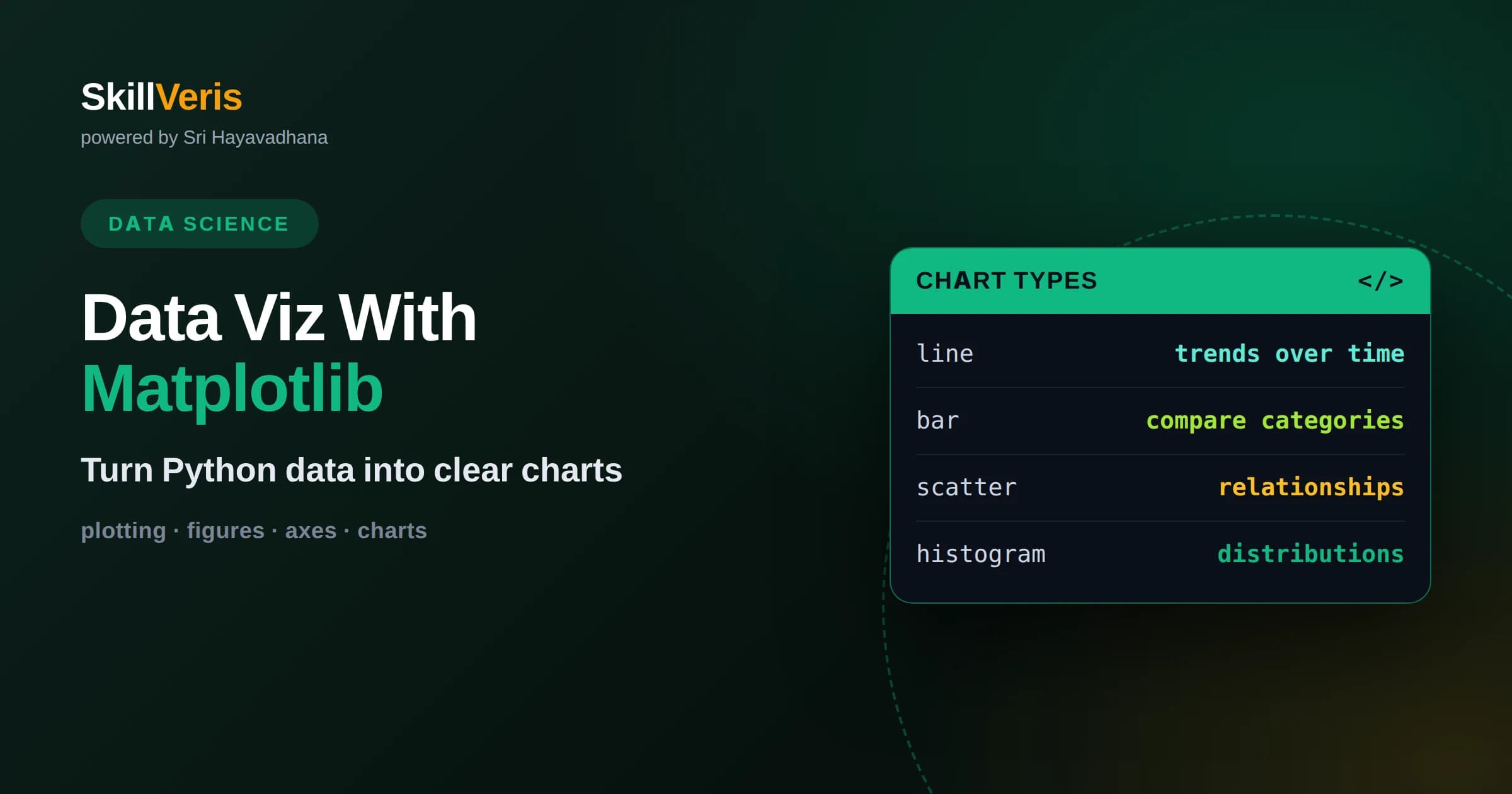
Matplotlib builds every chart from figures and axes, and understanding that structure is the key to controlling any plot precisely.
In this guide, you'll learn:
- The object-oriented interface, where you create figure and axes objects explicitly, is more reliable than the quick pyplot state-based shortcuts.
- A handful of chart types, line, bar, scatter, and histogram, cover the majority of everyday data storytelling needs.
- Good visualization is as much about labels, scale, and restraint as it is about the chart type you choose.
1What Is Matplotlib
Matplotlib is the foundational plotting library for Python, letting you turn numbers into charts with fine control over every visual detail. It can produce line charts, bar charts, scatter plots, histograms, and much more, and it renders them for the screen or saves them to image files for reports. Most other Python visualization tools are built on top of it, so learning Matplotlib gives you a foundation that transfers everywhere.
The library is famously flexible, which is both its strength and its learning curve. You can accept sensible defaults for a quick look, or you can adjust colors, fonts, axis scales, gridlines, and annotations until a figure is exactly right for publication. That range means Matplotlib serves the whole spectrum, from a fast exploratory glance at data to a polished chart in a formal document.
The single most important thing to grasp early is how Matplotlib organizes a plot. Once you understand its figure-and-axes structure, the rest of the library stops feeling like a pile of unrelated commands and becomes a coherent system you can reason about.
2The Figure And Axes Model
Every Matplotlib chart is built from two key objects: the figure and the axes. The figure is the entire canvas, the outer container that holds everything. The axes is an individual plot within that canvas, with its own x and y axis, data, and title. A figure can hold one axes or many arranged in a grid, which is how you create dashboards of multiple charts.
It is worth noting that axes, in Matplotlib's vocabulary, does not mean the x or y line. It means a whole plotting area. This trips up beginners constantly. When you read the documentation, an axes object is the thing you draw on, and the x-axis and y-axis are properties of that object.
Grasping this hierarchy unlocks the library. You create a figure, add one or more axes to it, and then call plotting methods on the axes to draw your data. Everything you might want to change, a title, a label, a limit, a color, is a method or property of either the figure or an axes. Once you think in terms of these objects, controlling any part of a chart becomes straightforward.
3The Two Interfaces: Pyplot And Object-Oriented
Matplotlib offers two ways to make plots, and knowing the difference saves a lot of confusion. The pyplot interface is a quick, state-based style where commands act on whatever the current figure and axes happen to be. It is concise and fine for a fast one-off chart, but it hides which object you are affecting, which gets confusing as plots grow more complex.
The object-oriented interface is the more reliable approach for anything beyond a throwaway plot. Here you explicitly create figure and axes objects and call methods on them directly, so it is always clear exactly which part of which chart you are modifying. This clarity is invaluable when you build multi-panel figures or reuse plotting code.
The recommendation is simple: learn the object-oriented style as your default. Create your figure and axes explicitly, keep references to them, and call methods on those references. You will occasionally use pyplot shortcuts for speed, but building the habit of naming your objects makes your plotting code far easier to read, extend, and debug.
4Line Charts For Trends
Line charts are the natural choice for showing how a value changes over a continuous dimension, most often time. By connecting data points with a line, they emphasize the shape of the trend, whether it is rising, falling, cyclical, or volatile. The eye follows the line and immediately grasps the direction and pace of change.
In Matplotlib you draw a line by passing your x and y values to the plot method of an axes. You can layer several lines on the same axes to compare series, distinguishing them with different colors and a legend. Beware of overcrowding, though: more than a handful of lines on one chart quickly becomes a tangle that hides the very trends you meant to show.
5Bar Charts For Comparison
Bar charts compare quantities across distinct categories, using the length of each bar to represent its value. Because people judge length accurately, bar charts make differences between categories easy to read at a glance. They are the right tool when your x-axis holds separate groups rather than a continuous scale.
Matplotlib supports vertical bars and horizontal bars, with horizontal versions especially useful when category names are long and would overlap along the bottom. You can also group or stack bars to show sub-categories within each group. A key rule for honest bar charts is to start the value axis at zero, because a truncated axis exaggerates small differences and misleads the viewer.
Ordering the bars deliberately adds clarity for free. Sorting categories from largest to smallest, rather than leaving them in an arbitrary order, lets the viewer read the ranking instantly and spot the top and bottom performers at a glance. Small choices like sorting, consistent bar spacing, and direct value labels often do more for readability than any amount of color or decoration.
6Scatter Plots For Relationships
Scatter plots reveal the relationship between two numeric variables by placing a dot for each observation at its x and y position. The resulting cloud of points shows whether the two variables move together, move in opposite directions, or have no clear relationship, and it exposes clusters and outliers that summary numbers hide.
Matplotlib's scatter method lets you go further by encoding extra dimensions through the size and color of each point, so a two-dimensional plot can convey a third or fourth variable. This makes scatter plots a powerful exploratory tool. When points overlap heavily, adding transparency so dense regions appear darker helps you see where the data concentrates rather than a solid mass.
Scatter plots are also where outliers announce themselves. A single point sitting far from the main cloud is often the most interesting thing on the chart, hinting at a data error, a rare event, or a genuine special case worth investigating. Because a scatter plot shows every observation rather than a summary, it is one of the most honest ways to look at a relationship before you commit to modeling it.
7Histograms For Distributions
A histogram shows the distribution of a single numeric variable by dividing its range into bins and drawing a bar for how many values fall in each bin. Unlike a bar chart of categories, a histogram's bars represent continuous ranges, and their heights reveal the shape of the data: where it clusters, whether it is symmetric or skewed, and whether it has one peak or several.
The number of bins is the crucial choice. Too few bins smooth away real structure into a featureless block, while too many bins turn the distribution into noise. It is worth trying a few bin counts to find one that shows the genuine shape. Histograms are indispensable early in any analysis for understanding what your data actually looks like before you model it.
Histograms also surface problems that summary numbers hide. A distribution with two separate peaks might mean you have accidentally mixed two different groups together, and a long tail of extreme values warns you that averages will be pulled off center. Plotting the distribution of every important variable at the start of a project is one of the cheapest and most revealing habits in all of data analysis.
8Multiple Plots With Subplots
Often you want several charts side by side to compare views of your data. Matplotlib arranges these with subplots, creating a grid of axes within a single figure. Each cell in the grid is its own axes that you plot on independently, which is how you assemble a small multiples layout or a compact dashboard.
The object-oriented interface makes subplots especially clean, because you receive an array of axes objects and address each one directly by its position. You can give each subplot its own title and labels while sharing an overall figure title. Keeping the panels consistent in scale and style helps the viewer compare them fairly rather than being misled by mismatched axes.
9Labels, Titles, And Legends
A chart without labels is a puzzle. Every plot you intend for anyone else, including your future self, needs a clear title, labeled x and y axes with units where relevant, and a legend whenever multiple series share the axes. These elements carry as much of the message as the data itself, and Matplotlib makes each one a simple method call on the axes.
The discipline of labeling well pays off constantly. Spell out what each axis measures, state the units, and give the chart a title that says what the viewer should take away rather than merely naming the variables. A little annotation, such as marking a notable point or a threshold line, can guide the eye to the story you want the chart to tell.
10Styling And Color Choices
Matplotlib gives you extensive control over appearance, from colors and line styles to fonts and gridlines, and it ships with built-in style themes you can apply to change a chart's whole look at once. A consistent style across a set of charts makes a report feel coherent and professional.
Color deserves special care. Use color to carry meaning rather than for decoration, and be mindful of viewers with color vision deficiencies by choosing palettes that remain distinguishable. Avoid overloading a chart with too many colors, and reserve a bright, saturated color to highlight the one thing you want to stand out. Restraint in styling almost always reads as more polished than maximalism.
11Saving And Exporting Figures
Once a chart is right, you will want to save it. Matplotlib can export figures to many formats, including raster images like PNG for the web and vector formats like SVG or PDF that stay crisp at any size and are ideal for print. Choosing the format to match the destination keeps your visuals looking sharp wherever they land.
Two settings matter most when saving. Resolution, controlled by dots per inch, determines how detailed a raster image looks, so use a higher value for print than for a quick screen preview. And trimming excess whitespace around the figure produces a tidy image that drops cleanly into a document. Getting these details right turns a good chart into a professional deliverable.
12Principles Of Good Visualization
Matplotlib lets you draw almost anything, but knowing what to draw is the real skill. Start from the message: decide what you want the viewer to understand, then pick the chart type that shows it most directly. A line for a trend, bars for a comparison, a scatter for a relationship, a histogram for a distribution. Matching form to purpose does most of the work.
Then strip away everything that does not serve the message. Remove clutter, keep scales honest, label clearly, and let the data speak. A simple, well-labeled chart that answers one question beats an elaborate one that tries to show everything and communicates nothing. Good visualization is an act of editing as much as an act of drawing.
13Practice Your Plotting Skills
The way to get fluent with Matplotlib is to plot real data repeatedly until the figure-and-axes model becomes second nature. Take a dataset you care about and make one of each core chart type, then improve each with proper labels, a clean style, and an exported file you would be happy to share.
On SkillVeris you can work through guided, hands-on lessons that build your Matplotlib skills from your first line chart to multi-panel figures and publication-ready styling. Practicing with real datasets, and focusing on communicating a clear message, is what turns Matplotlib from a reference you look up into a tool you reach for instinctively.
Related Reading
Get The Print Version
Download a PDF of this article for offline reading.
About the Publisher
SkillVeris Team
Data Science Team
Our data team shares real-world analytics, ML, and SQL insights grounded in industry practice.
View all postsRelated Posts
Never miss an update
Get the latest tutorials and guides delivered to your inbox.
No spam. Unsubscribe anytime.