Matplotlib and Seaborn: Data Visualisation in Python
SkillVeris Team
Data Science Team
Matplotlib gives you full control, while Seaborn gives you beautiful statistical charts in a single line.
In this guide, you'll learn:
- Always create axes explicitly with fig, ax = plt.subplots(), then call methods on ax.
- Add a title, axis labels, and a legend on every chart so the insight reads clearly.
- Use Seaborn for statistical plots like distributions, regressions, and pair plots.
- Use heatmaps with annot=True to surface correlation matrices during exploratory data analysis.
1Why Visualisation Matters
A table of numbers is hard to understand. A chart of the same numbers often makes the pattern immediately obvious. Good data visualisation is not decorative — it's the difference between an insight being acted on or ignored.
This guide covers the two most important Python visualisation libraries: matplotlib (the foundation, full control) and Seaborn (beautiful statistical charts with one line of code).
Imports
The standard imports used throughout this guide.
import matplotlib.pyplot as plt
import seaborn as sns
import numpy as np
import pandas as pd2Matplotlib Architecture
Matplotlib has a hierarchy: a Figure (the whole canvas) contains Axes (an individual plot area). Always create both explicitly.
Avoid the plt.plot() shortcut for anything beyond quick exploration — the explicit fig, ax approach works in loops, subplots, and saved figures without confusion.
Figure and Axes
Create the figure and axes, plot on the axes, then add a grid of subplots.
# Create figure and axes
fig, ax = plt.subplots(figsize=(10, 6))
# Plot on the axes
ax.plot([1, 2, 3], [4, 5, 6])
ax.set_title("My First Chart")
ax.set_xlabel("X Axis")
ax.set_ylabel("Y Axis")
plt.tight_layout()
plt.show()
# Multiple subplots in a grid
fig, axes = plt.subplots(2, 3, figsize=(15, 8))
# axes is a 2x3 array; axes[0,0] is top-left, axes[1,2] is bottom-right3Line Charts
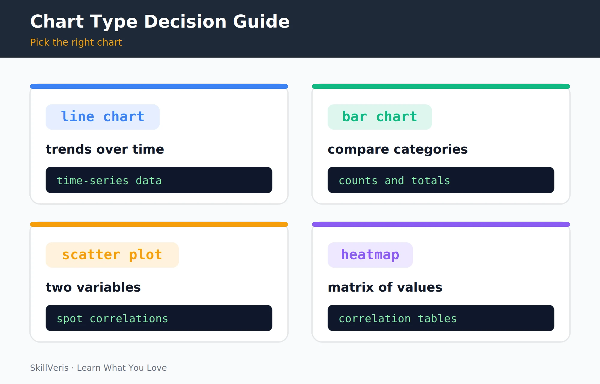
Line charts show trends over time. Plot multiple series with distinct markers, colours, and labels, then add a legend and a light grid for readability.
Monthly Sales Comparison
Plot two product series with markers, labels, and a horizontal grid.
# Monthly sales data
months = ["Jan", "Feb", "Mar", "Apr", "May", "Jun"]
sales_a = [120, 145, 132, 178, 190, 210]
sales_b = [ 95, 108, 125, 140, 155, 168]
fig, ax = plt.subplots(figsize=(10, 5))
ax.plot(months, sales_a, marker="o", linewidth=2, color="#3b82f6", label="Product A")
ax.plot(months, sales_b, marker="s", linewidth=2, color="#f59e0b", label="Product B")
ax.set_title("Monthly Sales Comparison", fontsize=14, fontweight="bold")
ax.set_xlabel("Month")
ax.set_ylabel("Units Sold")
ax.legend()
ax.grid(axis="y", alpha=0.3)
plt.tight_layout()
plt.show()4Bar and Horizontal Bar Charts
Bar charts compare values across categories. Vertical bars work for short labels; horizontal bars are better for long category names.
Vertical and Horizontal Bars
Add value labels to vertical bars, then build a horizontal version for long labels.
# Vertical bar chart
categories = ["Engineering", "Marketing", "Sales", "Support"]
headcount = [42, 18, 31, 15]
fig, ax = plt.subplots(figsize=(8, 5))
bars = ax.bar(categories, headcount, color=["#3b82f6", "#f59e0b", "#10b981", "#8b5cf6"])
ax.bar_label(bars, padding=3)  # add value labels on bars
ax.set_title("Headcount by Department")
ax.set_ylabel("Employees")
ax.set_ylim(0, 50)
plt.tight_layout()
# Horizontal bar (better for long category names)
fig, ax = plt.subplots(figsize=(10, 6))
y_pos = range(len(categories))
ax.barh(list(y_pos), headcount, color="#3b82f6")
ax.set_yticks(list(y_pos))
ax.set_yticklabels(categories)
ax.set_xlabel("Employees")
plt.tight_layout()5Scatter Plots
Scatter plots reveal the relationship between two variables. Adding a fitted trend line makes the correlation easy to read.
Study Hours vs Test Score
Plot the points, fit a first-degree polynomial, and overlay the trend line.
# Scatter: relationship between two variables
np.random.seed(42)
study_hours = np.random.uniform(1, 10, 50)
test_scores = study_hours * 8 + np.random.normal(0, 10, 50)
fig, ax = plt.subplots(figsize=(8, 6))
ax.scatter(study_hours, test_scores, alpha=0.6, s=60, color="#3b82f6")
# Add trend line
z = np.polyfit(study_hours, test_scores, 1)
p = np.poly1d(z)
x_line = np.linspace(study_hours.min(), study_hours.max(), 100)
ax.plot(x_line, p(x_line), color="#ef4444", linewidth=2, linestyle="--", label="Trend")
ax.set_title("Study Hours vs Test Score")
ax.set_xlabel("Study Hours")
ax.set_ylabel("Test Score")
ax.legend()
plt.tight_layout()6Histograms and Distributions
Histograms show the distribution of a single variable. Adding a vertical line at the mean gives an immediate reference point.
Distribution of Exam Scores
Bin 1,000 simulated scores and mark the mean with a dashed line.
# Histogram: distribution of a single variable
data = np.random.normal(60, 15, 1000)  # 1000 exam scores
fig, ax = plt.subplots(figsize=(8, 5))
ax.hist(data, bins=30, color="#3b82f6", edgecolor="white", alpha=0.8)
ax.axvline(data.mean(), color="#ef4444", linestyle="--", label=f"Mean: {data.mean():.1f}")
ax.set_title("Distribution of Exam Scores")
ax.set_xlabel("Score")
ax.set_ylabel("Frequency")
ax.legend()
plt.tight_layout()7Multiple Subplots
A grid of subplots packs several related charts into one figure — ideal for dashboards. Index into the axes array to plot in each cell, then save the whole figure.
A 2x2 Dashboard Grid
Add a figure-level title, plot in each cell, and save the result to PNG.
# 2x2 grid of subplots
fig, axes = plt.subplots(2, 2, figsize=(12, 8))
fig.suptitle("Sales Dashboard Q2 2026", fontsize=16, fontweight="bold")
# Plot in each cell
axes[0, 0].plot([1,2,3,4], [100,120,110,140])
axes[0, 0].set_title("Revenue Trend")
axes[0, 1].bar(["A","B","C"], [30, 45, 25])
axes[0, 1].set_title("Sales by Region")
axes[1, 0].hist(np.random.normal(50, 10, 200), bins=20)
axes[1, 0].set_title("Score Distribution")
axes[1, 1].scatter(range(20), np.random.rand(20) * 100, alpha=0.6)
axes[1, 1].set_title("Customer Value")
plt.tight_layout()
plt.savefig("dashboard.png", dpi=150, bbox_inches="tight")
plt.show()8Styling and Themes
Built-in styles and global rcParams change the look of every chart in a session. Pick a style for a consistent baseline, then tweak defaults like DPI, font family, and spine visibility.
💡Pro Tip
Remove the top and right spines (ax.spines["top"].set_visible(False)) on every chart. This single change makes charts look immediately more professional. Pair with a light grey horizontal grid and white background for a clean, publication-ready style.
Styles and Global Defaults
Apply a style and set session-wide rcParams.
# Available styles
print(plt.style.available)
# Apply a style
plt.style.use("seaborn-v0_8-whitegrid")  # clean white grid
plt.style.use("ggplot")  # R-style
plt.style.use("dark_background")  # dark mode
# Set global defaults for all charts in the session
plt.rcParams["figure.dpi"] = 150
plt.rcParams["font.family"] = "sans-serif"
plt.rcParams["axes.spines.top"] = False
plt.rcParams["axes.spines.right"] = False # remove box borders9Seaborn: Statistical Visualisation
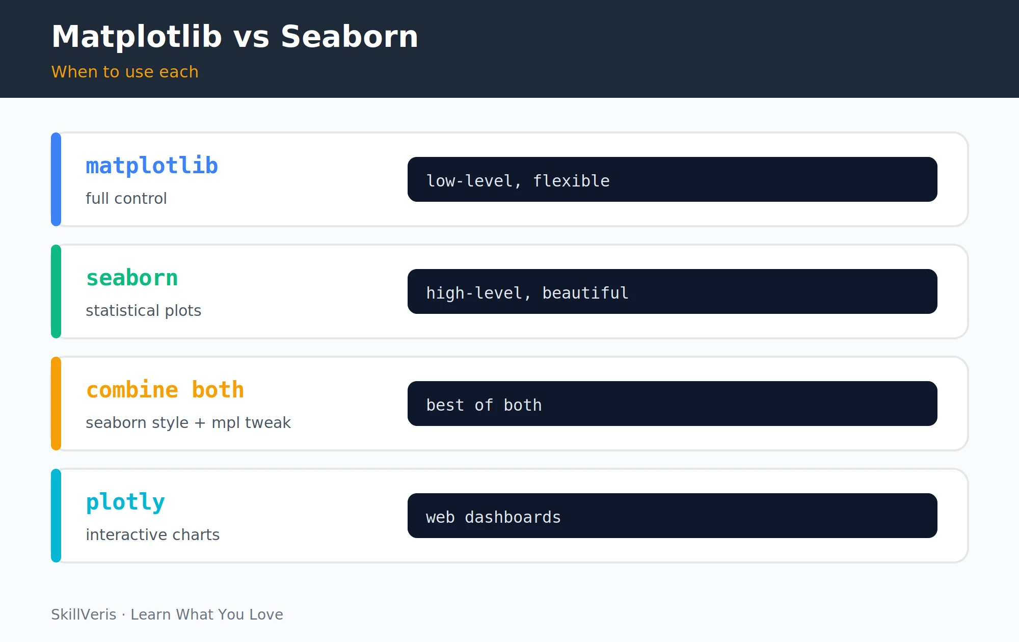
Seaborn produces beautiful statistical charts in a single line and integrates directly with matplotlib axes. It ships with built-in datasets and one-call plots for distributions, box plots, violins, regressions, and pair plots.
Seaborn Statistical Plots
Set the theme, load a dataset, and create several statistical plots.
import seaborn as sns
sns.set_theme(style="whitegrid")  # apply seaborn theme globally
# Load a built-in dataset
tips = sns.load_dataset("tips")
# Distribution plot with KDE
fig, ax = plt.subplots(figsize=(8, 5))
sns.histplot(tips["total_bill"], kde=True, ax=ax, color="#3b82f6")
ax.set_title("Distribution of Total Bills")
# Box plot: distribution across categories
fig, ax = plt.subplots(figsize=(8, 5))
sns.boxplot(data=tips, x="day", y="total_bill", ax=ax)
# Violin plot: richer distribution view
sns.violinplot(data=tips, x="sex", y="tip", hue="smoker")
# Regression plot: scatter + trend line in one call
sns.regplot(data=tips, x="total_bill", y="tip")
# Pair plot: all pairwise relationships in a dataset
sns.pairplot(tips, hue="sex")10Heatmaps and Correlation Matrices
Correlation heatmaps are essential in data science for spotting relationships between features at a glance. Annotate the cells and centre the colour map at zero so positive and negative correlations read clearly.
Feature Correlation Matrix
Compute the correlation matrix and render it as an annotated heatmap.
# Correlation heatmap (essential for data science)
iris = sns.load_dataset("iris")
corr = iris.select_dtypes("number").corr()
fig, ax = plt.subplots(figsize=(7, 6))
sns.heatmap(
    corr,
    annot=True,  # show correlation values
    fmt=".2f",  # 2 decimal places
    cmap="coolwarm",  # blue=negative, red=positive
    center=0,  # 0 correlation = white
    square=True,
    ax=ax
)
ax.set_title("Feature Correlation Matrix")
plt.tight_layout()11Saving Figures
Save figures in the format that fits the destination: PNG for web, SVG or PDF for print, or a bytes buffer for serving from a web framework. Always use bbox_inches="tight" to prevent labels from being clipped outside the figure boundary.
Export Formats
Write the figure to file formats or an in-memory buffer.
# Save as PNG (raster, for web)
fig.savefig("chart.png", dpi=150, bbox_inches="tight")
# Save as SVG (vector, for print or web)
fig.savefig("chart.svg", bbox_inches="tight")
# Save as PDF (vector, for documents)
fig.savefig("chart.pdf", bbox_inches="tight")
# Save to a bytes buffer (for serving via FastAPI or Streamlit)
import io
buf = io.BytesIO()
fig.savefig(buf, format="png", dpi=150, bbox_inches="tight")
buf.seek(0) # rewind before reading12Key Takeaways
A few consistent habits produce clean, professional charts whether you reach for matplotlib or Seaborn.
- Use fig, ax = plt.subplots() — always create axes explicitly.
- Every chart needs a title, axis labels, and (when multiple series) a legend.
- Remove top and right spines for a cleaner look; add a light horizontal grid.
- Seaborn excels at statistical plots (distributions, regressions, pair plots) with minimal code.
- Use heatmaps with annot=True for correlation matrices in EDA.
13What to Learn Next
Apply visualisation in real projects with these follow-up guides.
- Build a Streamlit Dashboard — embed your matplotlib charts in an interactive web app.
- Data Science Through Bollywood — apply every chart type in this guide to real film data.
- Pandas for Beginners — DataFrames integrate directly with matplotlib and Seaborn.
14Frequently Asked Questions
What is the difference between plt.show() and plt.savefig()? plt.show() displays the figure in an interactive window (or inline in Jupyter). plt.savefig() writes it to a file. Call savefig() before show() — calling show() first clears the figure, producing a blank saved file.
When should I use Plotly instead of matplotlib? Plotly creates interactive charts (zoom, hover, click) that work in browsers and Streamlit. Use it for dashboards where users need to explore data interactively. Matplotlib is better for static publication-quality figures (PDF reports, academic papers, social media posts) where interactivity isn't needed.
Why does my chart look different in Jupyter vs a script? Jupyter uses inline rendering at a fixed DPI; scripts open a GUI window. Use %matplotlib inline in Jupyter for inline display, or %matplotlib widget for interactive. In scripts, plt.show() opens the window and plt.savefig() saves without opening.
How do I make charts accessible for colourblind readers? Use colourblind-safe palettes: Seaborn's colorblind palette or matplotlib's tab10. Avoid red-green combinations. Add patterns or markers to distinguish lines beyond colour alone. Use sns.set_palette("colorblind") as a global default.
Related Reading
Get The Print Version
Download a PDF of this article for offline reading.
About the Publisher
SkillVeris Team
Data Science Team
Our data team shares real-world analytics, ML, and SQL insights grounded in industry practice.
View all postsRelated Posts
Never miss an update
Get the latest tutorials and guides delivered to your inbox.
No spam. Unsubscribe anytime.