Project: Build a Data Dashboard with Python and Streamlit
SkillVeris Team
Engineering Team
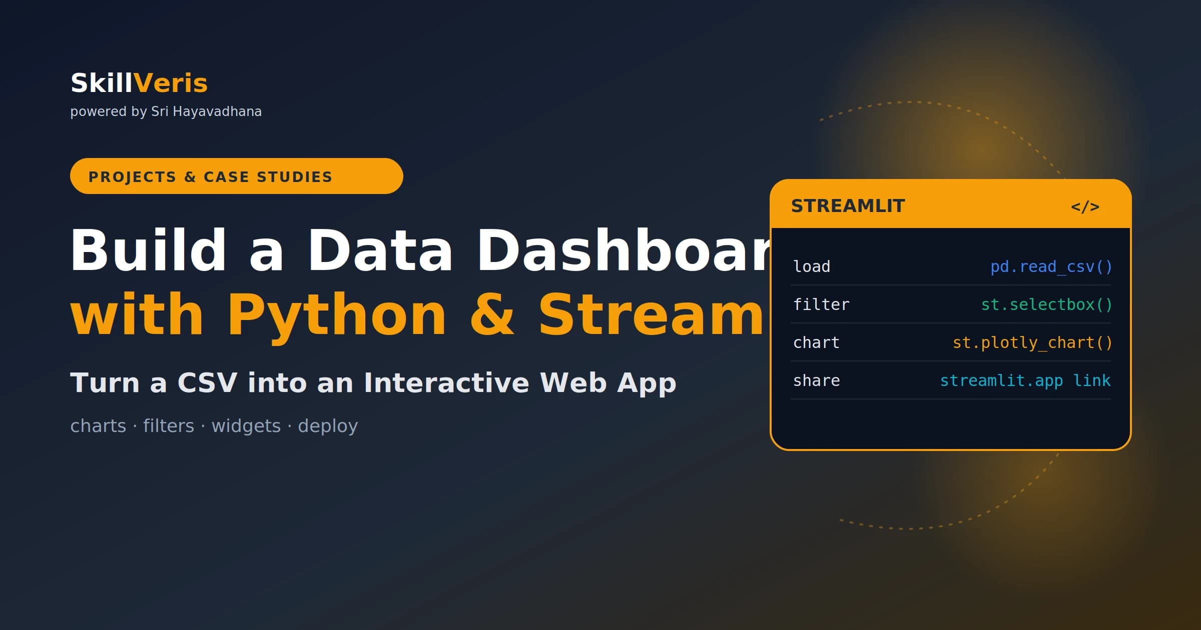
Streamlit converts a Python data analysis script into a shareable web dashboard with just a few extra lines of code.
In this guide, you'll learn:
- Add st.sidebar for filters, st.metric() for KPI cards, and st.plotly_chart() for interactive visualisations.
- The @st.cache_data decorator loads your CSV once so it isn't re-read on every widget interaction.
- Sidebar filters plus KPI metrics plus Plotly charts is the three-part structure behind most professional dashboards.
- Plotly charts are interactive by default, supporting hover, legend toggling, and zoom.
1What You'll Build
In this project you'll build a live sales analytics dashboard that loads data from a CSV, lets users filter it, and visualises the results interactively.
This pattern — load data, filter, visualise, share — is exactly how analysts and data teams build internal dashboards at companies of every size.
- KPI cards showing total revenue, total orders, and average order value.
- Sidebar filters for region and date range.
- A bar chart of revenue by product category.
- A line chart of daily revenue trend.
- An interactive data table with sorting and search.
- The finished app deployed publicly on Streamlit Community Cloud.
2Why Streamlit?
Before Streamlit, sharing a Python analysis meant exporting to a static HTML file or building a full Flask or Django app. Streamlit eliminates both options — you write Python, and it renders a web UI for you.
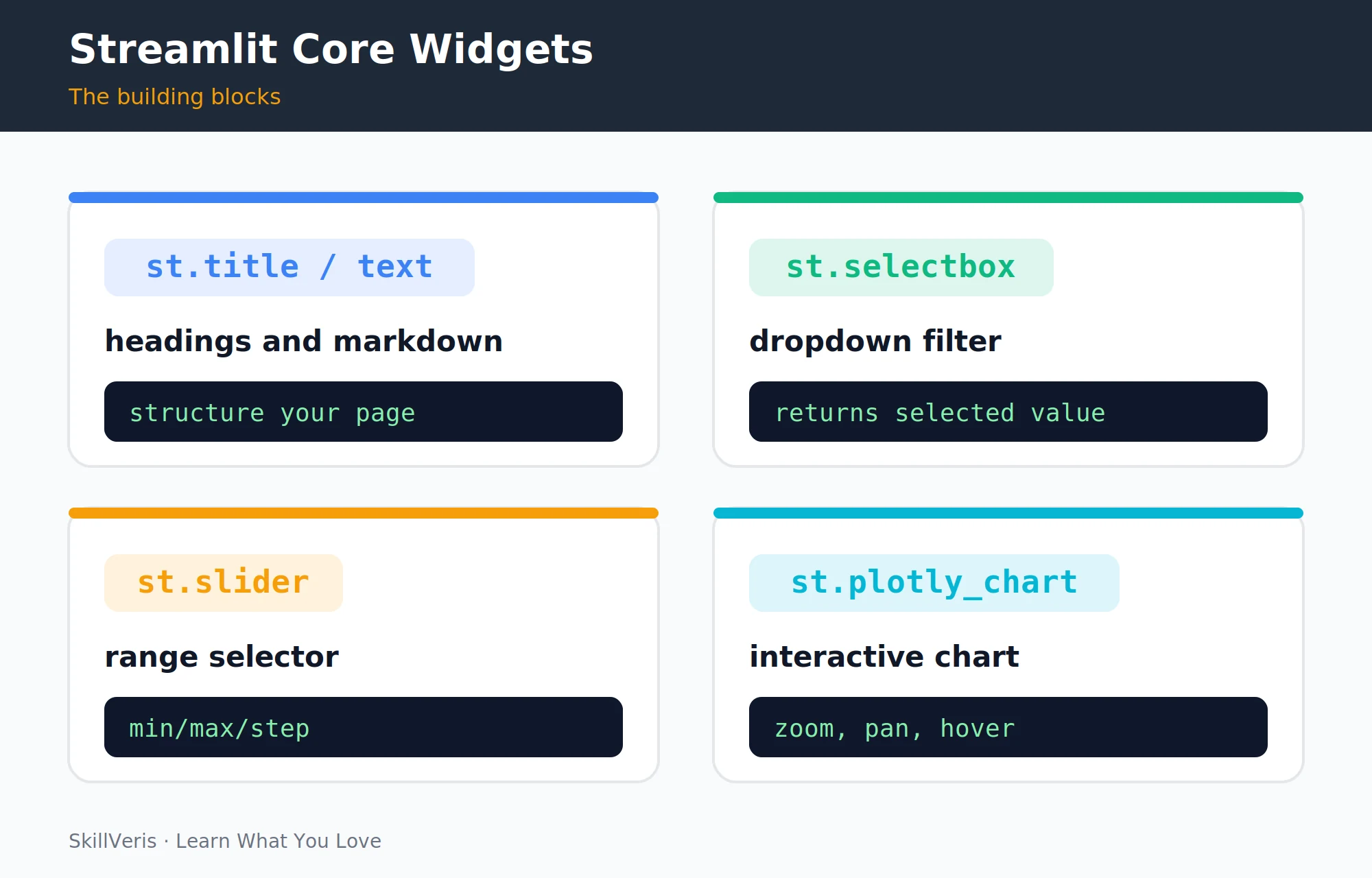
Four core widgets (title, selectbox, slider, and plotly chart) cover most dashboard needs, so you can focus on the data rather than the frontend.
- No HTML/CSS/JavaScript: all UI is Python code.
- Automatic re-run: the script re-runs top-to-bottom whenever a widget changes, so filters just work.
- Free hosting: Streamlit Community Cloud deploys from GitHub for free.
- Great for portfolios: a live, interactive URL is far more impressive than a Jupyter notebook screenshot.
3Setup and Installation
Install the required libraries, then grab a sample dataset to work with.
Download the sample superstore sales dataset from Kaggle (search "Sample Superstore") or use any sales CSV with columns for date, category, region, and revenue. Save it as superstore.csv in your project folder.
Install the libraries
Install Streamlit alongside pandas, Plotly, and openpyxl.
pip install streamlit pandas plotly openpyxlTest the install
Verify everything works by launching the bundled demo app.
# Test the install
streamlit hello4Loading and Exploring the Dataset
Create app.py to configure the page, set a title, and load the dataset.
The @st.cache_data decorator loads the CSV once and caches it — the file isn't re-read on every widget interaction.
app.py
Set up the page and define a cached data loader.
import streamlit as st
import pandas as pd
import plotly.express as px
st.set_page_config(page_title="Sales Dashboard", page_icon="[chart]", layout="wide")
st.title("[chart] Sales Analytics Dashboard")
@st.cache_data
def load_data():
    df = pd.read_csv("superstore.csv")
    df["Order Date"] = pd.to_datetime(df["Order Date"])
    return df
df = load_data()6KPI Metric Cards
Show the headline numbers at the top of the dashboard using st.metric().
st.metric() can also show a delta (the change versus a previous period) by passing a second argument — useful for comparing this month to last month.
KPI card code
Compute the totals and lay out three metric cards in columns.
total_revenue = filtered["Sales"].sum()
total_orders = filtered["Order ID"].nunique()
avg_order_val = total_revenue / total_orders if total_orders else 0
col1, col2, col3 = st.columns(3)
col1.metric("[money] Total Revenue", f"${total_revenue:,.0f}")
col2.metric("[box] Total Orders", f"{total_orders:,}")
col3.metric("[chart] Avg Order Value", f"${avg_order_val:,.2f}")7Bar Chart: Sales by Category
Group the filtered data by category and render a sorted bar chart with Plotly Express.
Plotly charts are interactive by default: hover for exact values, click legend items to hide series, and zoom with click-and-drag.
Bar chart code
Aggregate revenue by category and display it.
st.subheader("Revenue by Category")
cat_revenue = (filtered.groupby("Category")["Sales"]
    .sum().sort_values(ascending=False).reset_index())
fig_bar = px.bar(cat_revenue, x="Category", y="Sales",
    color="Category", text_auto=".2s",
    labels={"Sales": "Revenue ($)"},
    color_discrete_sequence=px.colors.qualitative.Set2)
fig_bar.update_layout(showlegend=False)
st.plotly_chart(fig_bar, use_container_width=True)8Line Chart: Revenue Over Time
Resample the orders by week and plot the revenue trend as a line chart with markers.
Line chart code
Group by week and render the daily revenue trend.
st.subheader("Daily Revenue Trend")
daily = (filtered.groupby(filtered["Order Date"].dt.to_period("W"))["Sales"]
    .sum().reset_index())
daily["Order Date"] = daily["Order Date"].astype(str)
fig_line = px.line(daily, x="Order Date", y="Sales",
    labels={"Sales": "Weekly Revenue ($)"},
    markers=True)
st.plotly_chart(fig_line, use_container_width=True)9Interactive Table
Show the filtered raw data using Streamlit's built-in interactive table.
Users can click any column header to sort, or use Ctrl+F to search within the table.
Interactive table code
Select the key columns and display them in a sortable dataframe.
st.subheader("Order Detail")
cols = ["Order Date", "Category", "Region", "Product Name", "Sales"]
st.dataframe(
    filtered[cols].sort_values("Order Date", ascending=False),
    use_container_width=True,
    height=300
)10Styling and Layout Tips
A few small layout choices make the difference between a cluttered script and a dashboard people actually use. Run through this checklist before sharing your dashboard publicly.
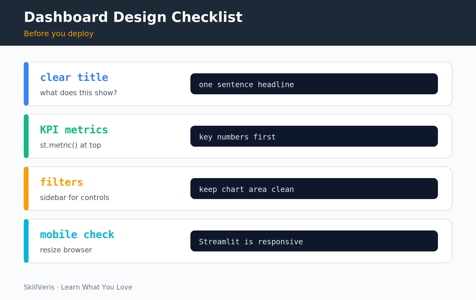
- Use layout="wide" in set_page_config() to use the full browser width.
- Place KPI metrics at the very top — they answer the most common question ("how are we doing?") before the user scrolls.
- Keep controls in st.sidebar so charts aren't interrupted by filter widgets.
- Add st.divider() between sections for visual separation.
- Use consistent chart colours — pick one Plotly colour scheme and stick with it throughout the dashboard.
💡Pro Tip
Add a download button below the filtered table so users can export the data: st.download_button("Download CSV", filtered.to_csv(index=False), "sales.csv", "text/csv"). This one line makes your dashboard genuinely useful to non-technical stakeholders.
11Deploying to Streamlit Community Cloud
Streamlit Community Cloud deploys directly from a public GitHub repo, so going live takes only a few clicks.
The app redeploys automatically on every GitHub push. Share the URL in your LinkedIn posts and portfolio README for maximum impact.
- Push your project (including the CSV and a requirements.txt) to a public GitHub repo.
- Go to share.streamlit.io, sign in with GitHub, and click "New app."
- Select your repo, branch, and app.py as the main file.
- Click Deploy — you get a public URL like https://yourname-sales-dashboard.streamlit.app in about a minute.
12Key Takeaways
Streamlit lets you turn a Python analysis into a polished, shareable web dashboard with minimal extra code and zero frontend work.
- Streamlit converts Python analysis into a shareable web dashboard with minimal extra code.
- @st.cache_data prevents repeated CSV reads on every widget interaction.
- Sidebar filters + KPI metrics + Plotly charts is the three-part structure behind most professional dashboards.
- Deploy for free on Streamlit Community Cloud from a public GitHub repo in under 5 minutes.
13What to Build Next
Once the dashboard is live, extend it with richer data sources or move on to deeper visualisation skills.
- Add a map chart (px.choropleth or px.scatter_geo) to show revenue by state or country.
- Connect to a live database instead of a static CSV (SQLite, PostgreSQL, or Google Sheets via gspread).
- Study Data Visualisation Best Practices and apply those principles to make your charts clearer.
14Frequently Asked Questions
Is Streamlit suitable for production dashboards? Yes, with caveats. Streamlit is excellent for internal business dashboards, analyst tools, and ML demos. For high-traffic public-facing apps, a dedicated frontend (React) calling a backend API scales better. Most data teams use Streamlit for internal use where performance limits aren't a concern.
Can I use Streamlit without knowing pandas? Pandas knowledge is needed to clean and transform the data before visualising it. If you're new to Pandas, complete our Pandas for Beginners guide first — the skills transfer directly to Streamlit projects.
What's the difference between Streamlit and Tableau? Tableau is a drag-and-drop BI tool that requires no code but offers limited customisation. Streamlit requires Python but gives you full control over layout, logic, and data transformations. Tableau is better for business users; Streamlit is better for data scientists and developers who need custom behaviour.
How do I handle large datasets in Streamlit? Use @st.cache_data for expensive data loads. For very large datasets (over 1M rows), pre-aggregate in the load step or connect to a database with server-side filtering instead of loading all data into memory.
Related Reading
Get The Print Version
Download a PDF of this article for offline reading.
About the Publisher
SkillVeris Team
Engineering Team
Our engineering team documents real build journeys so you can learn by doing, not just reading.
View all postsRelated Posts


Never miss an update
Get the latest tutorials and guides delivered to your inbox.
No spam. Unsubscribe anytime.